Part of the brief for this last project included creating a simple portfolio website. I wanted to base the site on my book layout and content for the time being, until my portfolio became more extensive. Originally, I wanted to create a book within a book, but I now came up against various problems.
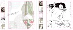
For a start some of the different types of gallery software compresses text and line to such an extent that the text within my pages would not be legible. In addition, my book layout had text coming over the borders at all angles, making it difficult to add html text to text-free images of the pages. The “jotted note” feel was integral to the design and the feel of the book so I either compromised on the graphics, or the feel of the book.
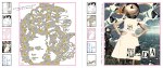
In addition, I had based my book layout on web design, which meant each page had a thumbnail navigation. If I put this into a gallery, would people assume they could click on the thumbnails? Would it annoy them that they couldn’t? Or would they be drawn in by a website within a website. I was very tempted to go with the last assumption, as it would be a far more interesting layout and make my life much easier! But in reality, I feel that I would need to build the gallery from scratch so that each thumbnail would also be “clickable”.
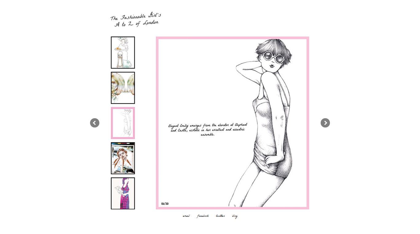
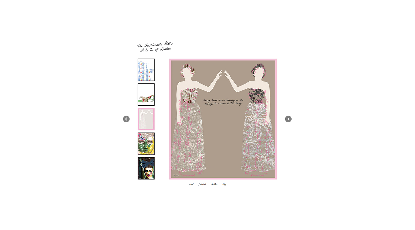
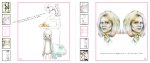
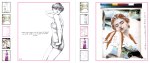
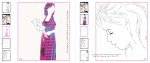
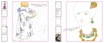
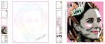
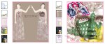
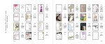
For now, I have created PNGs (of the pages rather than the spreads) from In Design, and then optimised the large PNG files in Photoshop, so that they could run on the web without too much delay (even the gallery software couldn’t cope with them as they were). I also extended the canvas horizontally on both sides of the image to the full 800px width of the gallery, so that the arrows of the gallery wouldn’t obliterate any of the illustration itself. The text isn’t as clear as I would like it to be, but it is not completely illegible either. That said, as per my previous observation above, I feel I would in any case need to create each page of the gallery as a new html page and link them together, in order to attain full functionality and optimum legibility. I didn’t have enough time to do this for this project, so I have used Easy Rotator’s software, which meant that I could run the entire website from one html page. I have managed to provide contact details and further information about my work from the navigational menu in the footer, which includes email, facebook, twitter and my blog.
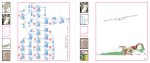
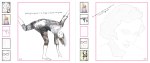
I coded the site so that the content centres vertically and horizontally. The wrapper was only 700px, so nearly all the content should fit onto even a smaller screen. Below are screenshots from Firefox in full screen mode. The top image is from my laptop screen and the bottom image is taken on a 22 inch screen. The site is incredily simple and I’m sure I would change things if I had time to tinker with it further, but it shows the book and my work. I just need to check the image quality of the content further and make sure that the gallery software works on all popular browsers.